
Introduction
As the chill of winter fades away, spring emerges as a season of renewal and rejuvenation. Nature awakens, flowers bloom, and the days grow longer, inviting us to refresh our living spaces. You might not realize it, but the colors you choose for your home can significantly affect your mood and the overall atmosphere. That’s where pastel color palettes come into play, offering a soft, inviting touch that perfectly aligns with the spirit of spring.
Pastels are not just visually appealing; they evoke feelings of calmness and tranquility. They bring a breath of fresh air into your home, making it feel lighter and more cheerful. In this article, we’ll explore how to incorporate charming pastel palettes into your living spaces, from your kitchen to your garden. You’ll find tips on creating a cohesive palette, selecting the right shades, and even some fun DIY projects to personalize your space. So, let’s dive in and discover how you can revitalize your home this spring with delightful pastel colors!
“Creating a cozy reading nook is all about maximizing comfort in a small space. It’s about intentional design that serves both function and feeling.”
– Interior Design Magazine
Understanding Pastel Colors
Pastel colors are characterized by their soft, muted hues that are created by adding white to a pure color, resulting in a lighter, less saturated shade. These colors—such as soft pinks, light blues, and gentle greens—are typically associated with springtime and evoke a sense of warmth and comfort. The beauty of pastels lies in their versatility; they can be used in various styles, from modern to rustic, making them an ideal choice for any home.
The psychology behind pastel shades is equally fascinating. According to color psychology, pastels are known for their calming effects, often promoting feelings of relaxation and serenity. This makes them perfect for creating spaces where you can unwind and recharge. Popular pastel colors include mint green, soft pink, baby blue, and lavender. When selecting pastels for your home, consider your existing decor and personal style. A mint green may resonate with a contemporary aesthetic, while a soft lavender might suit a more traditional setting.
To help you choose the right pastel for your home, consider the following:
| Pastel Color | Associations | Best Styles |
|---|---|---|
| Mint Green | Freshness, tranquility | Modern, Scandinavian |
| Soft Pink | Warmth, love | Traditional, Bohemian |
| Baby Blue | Calm, serenity | Coastal, Rustic |
| Lavender | Creativity, peace | Vintage, Eclectic |
The right pastel can transform your space, so take your time in choosing one that resonates with you and complements your existing decor.
Creating a Pastel Color Palette
Once you’ve settled on a few pastel colors that catch your eye, it’s time to create a cohesive color palette. Selecting complementary pastel shades can elevate your home’s aesthetic while ensuring a harmonious flow between rooms. It’s important to remember that balance is key; pairing pastels with neutral tones like whites, greys, or beiges can help anchor the lighter colors and prevent them from overwhelming your space.
When choosing your pastel palette, consider using color swatches to visualize how different shades work together. You can create a mood board with paint chips, fabric swatches, and images of decor items to see how your chosen colors interact. Online tools and apps, such as Adobe Color or Coolors, can simplify this process by allowing you to experiment with different combinations digitally.
Remember to keep the following considerations in mind when creating your pastel palette:
- Choose a primary pastel color to dominate the space.
- Identify two to three complementary colors for accents.
- Incorporate neutral tones to maintain balance.
- Visualize your palette with swatches and digital tools.
By thoughtfully curating your pastel color palette, you can create a serene and inviting atmosphere throughout your home.
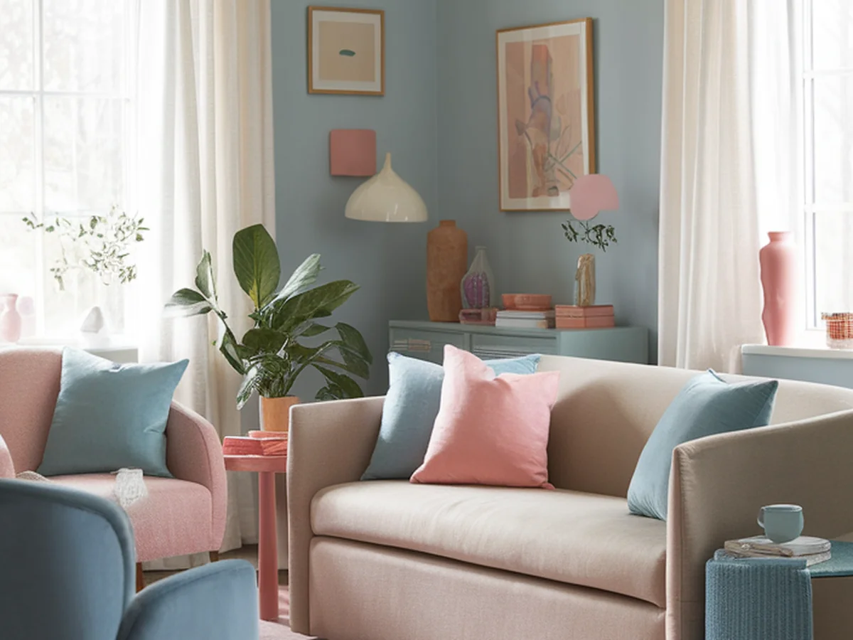
Incorporating Pastels in Living Spaces
Now that you have your pastel palette, it’s time to incorporate those lovely hues into your living spaces. One of the most effective ways to introduce pastels is through wall colors. Soft pastel walls can create a calming backdrop that sets the tone for the room. Consider painting one wall in a soft pink or mint green to serve as an accent, or go bold with an all-pastel room.
Accent furniture pieces are another fantastic way to infuse pastel colors into your living area. Look for sofas, chairs, or side tables in pastel shades that can serve as focal points. Accessories such as cushions, rugs, and artwork are also great ways to introduce pastel tones without making a permanent commitment. A few pastel cushions can instantly brighten up a neutral sofa, while a pastel rug can anchor the space.
To create striking focal points, consider the following tips:
- Use a large piece of pastel artwork to draw the eye.
- Arrange pastel decor items in clusters for visual impact.
- Mix and match different pastel shades for added interest.
With these strategies, you can effortlessly showcase the beauty of pastels in your living room, creating a space that feels both fresh and inviting.
Revitalizing the Kitchen with Pastels
The heart of your home deserves a refresh too! Incorporating pastel colors into your kitchen can create a cheerful and inviting atmosphere. Start by considering pastel cabinetry and countertops. Soft blue or green cabinets can add a touch of whimsy, while white or light grey countertops will keep the space feeling open and airy.
For those not ready to commit to a full renovation, pastel appliances and kitchenware are excellent alternatives. Look for pastel-colored toasters, mixers, or dishware that can add subtle pops of color. Additionally, pastel accessories like dish towels, linens, and even curtains can enhance the overall aesthetic without overwhelming the space.
If you have an open-plan kitchen, it’s essential to create a cohesive look. Here are some ideas to achieve that:
| Pastel Element | Suggested Colors | Complementary Neutrals |
|---|---|---|
| Cabinetry | Mint Green, Soft Pink | White, Light Grey |
| Appliances | Baby Blue, Lavender | Beige, Cream |
| Textiles | Peach, Pale Yellow | Soft White, Taupe |
By thoughtfully integrating pastels into your kitchen, you can create a space that feels inviting and vibrant, perfect for gathering with family and friends.
Pastel Color Schemes for Bedrooms
Your bedroom should be a sanctuary—a place to unwind and recharge. Pastel colors can help you achieve that serene atmosphere effortlessly. Start by painting the walls in a soft pastel hue, such as light lavender or baby blue. These colors not only create a calming environment but also promote restful sleep.
Next, focus on bedding and textiles. Layering different pastel shades can add depth and interest to your bedroom. Consider a soft pink duvet cover paired with mint green throw pillows. Don’t forget about pastel decor elements like artwork, lamps, and decorative accents that tie the room together.
Lighting plays a crucial role in enhancing pastel tones. Soft, warm lighting can make pastels appear even more inviting, while bright, harsh light may wash them out. Consider using bedside lamps with warm-toned bulbs or string lights to create a cozy atmosphere.
To summarize, here are some tips for incorporating pastels into your bedroom:
- Choose a calming pastel color for the walls.
- Layer bedding and textiles in complementary pastel shades.
- Add pastel decor items for visual interest.
- Utilize warm lighting to enhance the pastel hues.
With these strategies, you can create a tranquil retreat that embodies the essence of springtime.
Springtime Garden and Outdoor Spaces
As the weather warms up, don’t forget to extend your pastel palette to your outdoor spaces. Using pastel colors in outdoor furniture and accessories can create a charming, inviting ambiance for your garden or patio. Look for pastel-colored chairs, tables, and cushions that complement your style while echoing the beauty of spring.
In addition to furniture, consider planting pastel flowers and plants in your garden. Shades like pale pink peonies, lavender, and light blue hydrangeas can create a harmonious, visually appealing garden. Grouping these flowers in clusters or using them as borders can enhance the overall look of your outdoor space.
To further enhance your garden’s pastel theme, consider incorporating pastel-themed outdoor decor. Options such as colorful lanterns, pastel cushions for seating, and even garden art can tie the theme together beautifully.
Here are some tips for maintaining a cohesive indoor-outdoor color flow:
- Match indoor pastel colors with outdoor furniture.
- Use similar pastel shades in both spaces for continuity.
- Incorporate pastel planters to connect the two areas.
By thoughtfully integrating pastels into your garden and outdoor spaces, you can create a seamless transition from your home to the great outdoors, perfectly capturing the essence of spring.
DIY Projects to Bring Pastels Indoors
If you’re feeling creative, there are plenty of DIY projects you can undertake to incorporate pastels into your home. Simple painting and upcycling projects for furniture can be a fun way to personalize your space. Try repainting an old chair in a soft pastel shade or creating a pastel side table from scratch.
Creating pastel artwork or wall hangings is another great project. You can use canvases, wood, or even fabric to craft your unique pieces. Experiment with different pastel colors and techniques to create a stunning focal point for your room.
Don’t forget about your garden! Crafting pastel-themed planters or garden decor can add a personal touch to your outdoor space. You can paint terracotta pots in pastel shades or create decorative garden stakes using colorful materials.
Here are a few project ideas to inspire your creativity:
- Repaint an old dresser in a pastel color.
- Create a pastel canvas art piece for your living room.
- Make DIY pastel planters for your garden.
- Craft seasonal decorations in pastel colors.
With these DIY projects, you can easily incorporate pastels into your home while expressing your creativity.
Tips for Maintaining a Pastel Aesthetic Year-Round
Once you’ve created your pastel oasis, it’s important to maintain that aesthetic throughout the year. Seasonal adjustments can help keep your decor feeling fresh. For instance, swapping out pastel decorations for bolder colors in the fall and winter can add variety while maintaining your overall pastel theme.
Mixing pastels with other color trends is another way to keep your decor dynamic. Pairing pastels with deep jewel tones can create a rich, sophisticated look, while combining them with earthy tones can lend a more organic feel.
To keep pastel colors fresh and vibrant, make sure to regularly clean and maintain your decor items. Dust and grime can dull their beauty, so be proactive in caring for your space. Additionally, regular decluttering can help maintain a light atmosphere, ensuring your home feels open and inviting.
In summary, consider these tips for keeping your pastel aesthetic alive:
- Adjust decor seasonally to keep it fresh.
- Mix pastels with other colors for visual interest.
- Regularly clean your decor items.
- Declutter regularly to maintain a light atmosphere.
By implementing these strategies, you can enjoy the beauty of pastels in your home all year round.
Conclusion
Embracing pastel palettes in your home decor can significantly enhance your living space, bringing in the lightness and warmth of spring. From soothing wall colors to charming decor items, pastels can create a serene atmosphere that reflects both your personal style and the spirit of the season.
As you explore these ideas and incorporate pastels into your home, remember to express your creativity and have fun with the process. Whether you’re painting a room, adding pastel accents, or embarking on DIY projects, each step brings you closer to a revitalized space.
We invite you to share your pastel home transformations with us! Your creativity can inspire others to bring the joy of spring into their homes. Together, let’s celebrate the beauty and vibrancy that pastel colors can bring, creating spaces that truly reflect who we are.
Frequently Asked Questions
What are pastel colors?
Pastel colors are soft, muted shades created by mixing a pure color with white. They are often associated with spring and evoke feelings of calmness and tranquility. Examples include soft pink, baby blue, mint green, and lavender. Pastels can be used in various design styles, making them versatile for home decor.
How can I incorporate pastels into a small space?
In small spaces, it’s important to use pastel colors strategically. Consider painting one wall in a pastel shade to create an accent without overwhelming the area. Use pastel decor accessories like cushions, artwork, or throws to add color without taking up space. Remember to balance pastels with neutral tones to maintain an open feel.
Are pastels suitable for all design styles?
Yes, pastels can be adapted to suit various design styles, from modern to traditional. The key is to choose the right shade and pair it with complementary colors and materials. For example, mint green may work well in a Scandinavian setting, while soft pink could enhance a vintage-inspired room.
How do I choose the right pastel colors for my home?
When selecting pastel colors, consider your existing decor, furniture, and the mood you want to create. Start with a primary pastel color and choose two to three complementary shades. Use color swatches or mood boards to visualize how different colors interact before making a decision.
Can I mix pastels with other color trends?
Absolutely! Mixing pastels with other color trends can create a dynamic and visually interesting space. Pair pastels with deeper jewel tones for a sophisticated look or with earthy tones for a more organic feel. Just ensure that the overall palette feels cohesive and balanced.